|
Wednesday, August 17, 2011
More graphic designs
12:07 AM
Oh my, i realised i forgot to update this blog :sI SHALL UPDATE MORE!!!!!
Here are a few more graphic designs that i have done so far:
For these 3 designs, i was supposed to design something that shows the essence of the word :) 3 CONDITIONS: NO CREATING OF SHAPES FROM PENS MUST USE TEXT & MANIPULATE FROM THERE MUST EXPLAIN THE WORD THROUGH IMAGERY :)
"Playful" When I think of the word playful, i think about slides and a typical childhood pool scene. Why? I have no idea too!!
The water and the slide is made out of "S" The ladder: "H" Minions: "O", ":", "i" and "D" Clouds: "C" Sun: "i"
At first i only had one gigantic minion but somehow i felt that it didnt bring out the essence of playfulness. Hence i gave him some friends ^^ and it worked!!! I also decided to make it seem like a cycle, so that it kind of brings some movement to the work and also shows that as innocent kids, we do not mind doing the same thing over and over and over again, we are still having fun
I think the title speaks for itself, hahahahaha "Congestion" The arrows were just obtained from the T or the I, with a littttleeeeee bit of manipulation.
Imagine that the arrows were people, everyone wants to get across, but no one will let the other have their way. There will be congestion.
At first i thought about traffic, but i was not sure how to draw the different views of cars, and it would be weird to have cars from the birds eye view since they'd all pretty much be rectangles.. So i decided on arrows. I feel that arrows create a sort of tension when they are pointing towards each other, yet creating a sense of harmony when pointing in the same direction. Starting with 4 big arrows in the centre, i decided to give them teams and added more arrows beside them, so that no matter where you look in the picture, it leads you to the centre. Red, Blue, Green and Yellow were chosen because of the primary colours and they contrast which highlights the different themes. ^^ Obviously, this is "Scale" This was the first one i did and i thought i had to use the word itself :/ If not i would have used shapes, blah :( Anyways, i was inspired by magazines and how sometimes designers would repeat the same image over and over again, rotate it, flip it, up size, down size, etc. I tried it out and used pink, orange and black to show each separate direction. At first i used 3 contrasting colours like blue, red and bright orange, but they clashed so much and you couldnt really tell what the word was because it was so messy. so I decided to have a foreground and a background.. The orange and pink words are less opaque so that they are duller and fade into the background. On the other hand, the black words are bold and hard so they stand out and seem to pop out, coming in to the foreground :)  did these last year, i was supposed to manipulate the words using illustrator, only by creating out lines and manipulating the points :) Basically, the designs explain what the words mean and i really like the munch one although it's really simple but it's just so cute. heeheeee
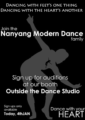
This was the poster I designed for CCA auditions 2011. Inspired by the quote above: "dancing with the feet's thing, dancing with the heart's another", i decided to put a mini dancer in the heart of another dancer. Since the modern dance official colours are white, black and red, i decided to use monochrome black since it'd be cheaper to print anyway. hahahaha. The hardest part of this design would be obtaining the silhouette of the dancer whereby i had to painstakingly trace a SUPER DUPER pixelated picture of a dancer in illustrator -_- They were so pixelated i couldnt even see their eyes, zoomggggg.
Some of you would ask why cant i just use another pose? Well i feel that these 2 poses represent modern dance the best as modern dance is grounded but we also sometimes have jumps. The bigger grey dancer stays grounded and the black dancer jumping is smaller because i feel that when I dance, my heart soars and i feel very light hearted, stress free, even if i portray a very serious character outside. I feel that Grande Jetes are too ballet so i decided on this jump which is more free style and care free, kind of off-balanced which is one of the key moves in modern dance :) I like the grey dancer's pose because one of our exercises requires us to point in freestyle and so far i've never seen anyone point like this so it kinda drew me to it :P
I really enjoy doing graphic designs, i am proud to say that ILLUSTRATOR.Ai IS MY FRIEND ^^
Labels: art works
|
 C L A R E


