|
Wednesday, August 24, 2011
course work idea
2:53 AM
Okay a lot of people(non-aep) have asked me what im doing for course work.
And when i reply them: Recipe Book
I get confused faces followed by a "huh?" or a you-must-be-joking face
Then most usually ask, "So you're copying off a recipe book? For what? Isn't that tiring?"
OH SILLY BILLIES.
I AM CREATING MY PERSONAL RECIPE BOOK >)
in which my recipes determine certain aspects of life.
I just use food to represent it so that it is more interesting & I have more fun exploring about food and its meaning.
If you think im making an odinary burger with bun, patty, lettuce, bun,
well you're wrong :)
So how did i come up with this idea?
Well i kind of decided that i would base my course work on food since last year
Initially i wanted to do an installation of a buffet table, representing your mood when you eat. Hence when the viewer walks across the spread of food, the food gets more appetising and the table gets more posh. I related this to how when you walk across and eat more, you are more satisfied and happy, no longer worrying or struggling.
BUT
Mrs Tan saw a loop hole and told me that the ideas are hard to connect, they practically exist as 2 different ideas. I also think that she didn't think that i have the drive to complete this within the timeframe. So she suggested others like a painting or a cook book. And so i brain stormed again and arrived at this idea :)
I really have to thank Mrs Tan from saving me from commiting suicide. I mean, I obviously over estimated myself when i wanted to do a buffet table. That would mean A L O T of prep work, A L O T of moulding of food, A L O T of time, A L O T of sourcing for materials, to summarize, A L O T of hard work.
I mean, I was one of the latest to start on my final work. And now im desperately trying to complete it, forcing myself to draw, colour or design every single day. I really hope that my prep work would be able to cover the 8 boards.. So my idea has been simplified tenfold as compared to the installation art work yet im still struggling. Especially because this year is the graduating year and work load has increased, promotion criteria has been raised and SYF. STRESS. Can you imagine me staying back every single day to at least 6 or 7, crafting, moulding, gluing? Well I cant, I think I would just give up.
Back to the recipe book,
my main source of inspiration is: Dawn Tan
I've been reading her blog for a couple of months before deciding I would base my course work on food. Well, basically her main subject matter is food.. and she paints food recipes, and kind of gave me some insight to how my course work would turn out :)
Another reason why i arrived at this idea would be that my mom told me that art should represent something, it shouldn't be something you can find everywhere or anywhere. Which is true, I mean, there are millions of recipe books in the world.. I thought about poverty and how they lack food, but then i wanted something I could relate to.. Something meaningful to me as well as the world. So I was thinking about what im gonna do with my life, where I'm heading, who I really am?
And then it struck me
I thought about the qualities that make me who I am, or how such qualities can help me improve myself and become a better person. This can also remind others that to succeed, you need a few key characteristics and traits. Just like how to make a tasty successful dish, you need a few key ingredients to make it possible.
I hope that through the making of this art work, I would be able to permanently tattoo such reminders to be a better person, to never keep trying, in my brain. That during the process of shading, colouring and designing, i can see this challenge and incoporate the traits that im representing in side me as well :) Just like how im currently drawing about determination, and i am determined to finish my course work and make my effort worth it.
I hope that when others view my course work, they can see the meaning behind it. That they can reflect on how they are themselves. Maybe the images they view would create a visual impact on them and remind them to change for the better and get rid of their bad habits. I hope that all of them would succeed in life and make the best out of it, the perfect personal recipe.Labels: art works, coursework
Sunday, August 21, 2011
pancakes
8:10 AM
I'm so bored im looking at pancakes!!

Cute or what?
It's like a fusion of the past with the present
Pacman used to be my childhood game and now it's being made out of pancake on a modern pancake grill.

Taco!!
Something salty turned into somethine sweet

Bees!!
The bee hive is just ingenious hahaha. stacking different sizes of pancakes up.

Now that's just wrong, you'd never be able to fly that plane bro.

This is my favourite one yet.
I feel like i can spin it for the entire morning hahahaha
Go to jimspancakes for more awesome pancakes!
I really like it how Allie's so entertained with her pancakes her dad makes for her. Lucky girl, i wish my dad made awesome pancakes :( Maybe i'll try making such unique pancakes when im free (after i've mastered making normal pancakes too)
Yes this has been one of my inspirations for my coursework,
about having fun with food and that food is not merely for eating, it can hold some meaning, represent something in life, it's not merely for survival. Just like manipulating food to represent something you like or need. Because you are the chef, you decide how the food will appear and taste. You bring meaning to it.Labels: coursework, inspiration
Saturday, August 20, 2011
Artstage's nakedman
2:20 AM
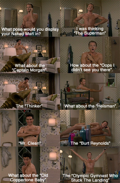
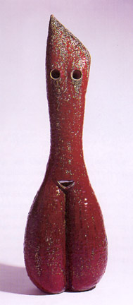
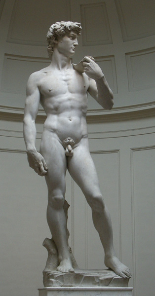
If you're a fan of TV comedy series, "How I Met Your Mother" you would know about the "Naked Man" and how it attracts girls ;) Art Stage 2011 also had a naked man in an artwork featuring the famous "The Two Fridas" (1939) by Frida Kahlo, a viewer and the artist. The artist and the viewer would then copy the pose and position of the fridas as shown below: The only obvious difference? Clothes.. if the artist had clothes. Mr. T Venkanna caused a huge stir in Singapore which is a fairly conservative country, by posing completely nude in a public art exhibition. I personally found this as an eye openner because art can be anything, just like the dadaist's theory of "i found it, i named it, therefore it is art" hahaha. Being a dancer, i am aware of dancers being required to dance nude yet be completely open and confident about it. Of course I have never done that before, but I have recently seen a piece, "Sehnsucht" with female dancers bearing their chests confidently, what ever size they may be. I felt that it was completely acceptable and not offensive at all, infact the dancers were so beautiful and confident, as if they were completely clothed. They even danced with other male dancers without feeling uneasy and this was when i realised that nudity is art too, after all, we weren't born with clothes on. This is our true human form. It is very common for artists to scuplt a nude figure.. manipulate the human form.. paint nude models.. but how many artists actually dare to showcase their own bodies in public, making themselves part of the art work themselves? How many artists dare to invite strangers to be part of the work, not afraid that the viewer would mess up the work and spoil the inteded message/effect of the work? I dare say a handful. Venkanna did the unconventional and inspired me to dare to do things people usually do not do.
Venkanna's artwork did cause a stir in Singapore, but i feel that this was something new to the art scene here. In remember in the artist square in paris, a woman was completely nude and was splashing paint on herself in public as a form of art. She received a warm welcome from the audience even though it was freezing cold there. It was considered completely acceptable in Paris, but I am sure that in Singapore, she would get stomped or something ridiculous. However, the art work being behind a black curtain shows that Venkanna is aware of the conservative aspect of Singaporeans. Hence the black curtain serves as a filter, whereby only people accepting nudity as art can choose to go in to appreciate his work. People who deem nudity as unacceptable, can choose to walk away and their view is blocked by that black curtain. I feel that we live in a country who does not dare to accept new things. If Venkanna dares to take photos of himself, posing like a girl, holding a stranger's hand, completely nude.. Why shouldn't you, completely clothed, be able to simply hold his hand and take a picture with him? This artwork is truly something new to Singapore and I hope that more singaporeans can be more open to art and accept the once deemed unacceptable.
Labels: writings
Wednesday, August 17, 2011
COURSE WORK SNEAKS!!
2:14 AM
Tired of stealing colour pencils from Chermaine, I got one for myself in the end ^^

Zomg, cOLOURSS


Pile of pretzels (incomplete)
To show the difference between 1 pretzel and many pretzels, how 1 appears to be wayyyy more complicated than the other.
A pretzel. Focuses on the forms and tones, like how the pretzel twists and bends and where the shadows are.
Drew some pretzels for course work, idk why but I simply love pretzels.. It's like my favourite comfort food, esp auntie anne's cinnamon pretzels ^^
Hence, I am currently as happy as...
This guy!! ^^

I drew the flour sacks as if they were were alive, as i feel joy should come from within.
The flour sakcs are meant to show a positive attitude, which is why they are cheering and jumping and seemingly going "YES!! I CAN DO IT!"
Labels: art works, coursework
More graphic designs
12:07 AM
Oh my, i realised i forgot to update this blog :sI SHALL UPDATE MORE!!!!!
Here are a few more graphic designs that i have done so far:
For these 3 designs, i was supposed to design something that shows the essence of the word :) 3 CONDITIONS: NO CREATING OF SHAPES FROM PENS MUST USE TEXT & MANIPULATE FROM THERE MUST EXPLAIN THE WORD THROUGH IMAGERY :)
"Playful" When I think of the word playful, i think about slides and a typical childhood pool scene. Why? I have no idea too!!
The water and the slide is made out of "S" The ladder: "H" Minions: "O", ":", "i" and "D" Clouds: "C" Sun: "i"
At first i only had one gigantic minion but somehow i felt that it didnt bring out the essence of playfulness. Hence i gave him some friends ^^ and it worked!!! I also decided to make it seem like a cycle, so that it kind of brings some movement to the work and also shows that as innocent kids, we do not mind doing the same thing over and over and over again, we are still having fun
I think the title speaks for itself, hahahahaha "Congestion" The arrows were just obtained from the T or the I, with a littttleeeeee bit of manipulation.
Imagine that the arrows were people, everyone wants to get across, but no one will let the other have their way. There will be congestion.
At first i thought about traffic, but i was not sure how to draw the different views of cars, and it would be weird to have cars from the birds eye view since they'd all pretty much be rectangles.. So i decided on arrows. I feel that arrows create a sort of tension when they are pointing towards each other, yet creating a sense of harmony when pointing in the same direction. Starting with 4 big arrows in the centre, i decided to give them teams and added more arrows beside them, so that no matter where you look in the picture, it leads you to the centre. Red, Blue, Green and Yellow were chosen because of the primary colours and they contrast which highlights the different themes. ^^ Obviously, this is "Scale" This was the first one i did and i thought i had to use the word itself :/ If not i would have used shapes, blah :( Anyways, i was inspired by magazines and how sometimes designers would repeat the same image over and over again, rotate it, flip it, up size, down size, etc. I tried it out and used pink, orange and black to show each separate direction. At first i used 3 contrasting colours like blue, red and bright orange, but they clashed so much and you couldnt really tell what the word was because it was so messy. so I decided to have a foreground and a background.. The orange and pink words are less opaque so that they are duller and fade into the background. On the other hand, the black words are bold and hard so they stand out and seem to pop out, coming in to the foreground :)  did these last year, i was supposed to manipulate the words using illustrator, only by creating out lines and manipulating the points :) Basically, the designs explain what the words mean and i really like the munch one although it's really simple but it's just so cute. heeheeee

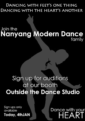
This was the poster I designed for CCA auditions 2011. Inspired by the quote above: "dancing with the feet's thing, dancing with the heart's another", i decided to put a mini dancer in the heart of another dancer. Since the modern dance official colours are white, black and red, i decided to use monochrome black since it'd be cheaper to print anyway. hahahaha. The hardest part of this design would be obtaining the silhouette of the dancer whereby i had to painstakingly trace a SUPER DUPER pixelated picture of a dancer in illustrator -_- They were so pixelated i couldnt even see their eyes, zoomggggg.
Some of you would ask why cant i just use another pose? Well i feel that these 2 poses represent modern dance the best as modern dance is grounded but we also sometimes have jumps. The bigger grey dancer stays grounded and the black dancer jumping is smaller because i feel that when I dance, my heart soars and i feel very light hearted, stress free, even if i portray a very serious character outside. I feel that Grande Jetes are too ballet so i decided on this jump which is more free style and care free, kind of off-balanced which is one of the key moves in modern dance :) I like the grey dancer's pose because one of our exercises requires us to point in freestyle and so far i've never seen anyone point like this so it kinda drew me to it :P
I really enjoy doing graphic designs, i am proud to say that ILLUSTRATOR.Ai IS MY FRIEND ^^
Labels: art works
|
Search
Labels
others
inspirations
writings
art works
course work
photography
Archives
 January 2011 January 2011
 May 2011 May 2011
 August 2011 August 2011
 September 2011 September 2011
Friends
Chermaine
Chiawei
Elizabeth
Heyao
Jiashin
Linhui
Liyi
Lois
Mingzhen
Rachel
Ruisian
Shihui
Shiyin
Shiyun
Valerie
Xinda
Xindi
Xuedi
Xueying
Zhiping
Zhiyi
Zhuhong
|
 C L A R E


