|
Monday, September 26, 2011
Address (Project: Another Country)
7:18 AM
Address (Project: Another Country), Alfredo Juan Aquilizan & Maria Isabel Gaudinez- Auilizan
An installation that caught my eye during the Singapore Art Biennale 2008
would be the ‘Address (Project: Another
Country)’ by the couple, Alfredo Juan Aquilizan and Maria Isabel
Gaudinez-Aquilizan, who are both not local. They used to live in Philippines
then migrated to Australia.
Inspired from the balikbayan
box, they began to “cube” objects they have been storing in their home for more
than 10 years. And by joining these “cubes” of objects together, the couple
managed to form a “room”. This “room” created has a door and a narrow
passageway for the audience to actually go inside the “room” and view the other
side of the balikbayan box.
I think that this idea is very
creative as you could walk through the passageway in the “room” without worrying
that the objects would start crumbling down or bits and pieces would fall on
you even though the objects are not glued together. These items are arranged in
an artistic manner such as the cubes were clearly defined even without a
separating line.
Balikbayan
boxes are used a lot by Filipino migrants to store and relocate their
belongings from one place to another. The Aquilizans used
these boxes to “cast” their own belongings as they migrated from the
Philippines to Australia. To me, this is a smart idea as instead of letting so
many items go to waste by throwing them away, the Aquilizans used them to
create an art work. It sounds abit peculiar but I feel that the outcome of
piling your unwanted objects in such a way is really interesting and something
new to many people.
I got a
shock when I looked closer at the items piled together as some of the
balikbayan boxes contain scary items. For example, glow in the dark pictures of
monsters, severed Barbie dolls, a baby doll’s arm sticking out of a pile of blankets,
etc. However, some items were really cute and it just creates a temptation
to pluck items from that “cubes”. Such items include: Mr Happy toy, teddy
bears, figurines, etcetera. Thinking about how the rest would crush my friends
and I if one item was taken out, the possible outcomes takes that feeling away.
Some
items that I found funny were naked baby dolls getting squashed by towels, a
Telly tubby toy behind a microphone and toy houses with toys living in them.
These items also reminded me of how much stuff I can have at home. It made me
want to clean up my house one day and donate unwanted stuff to the Salvation
Army.
Come to
think of it, being able to pack so many objects into such neat “cubes” really
takes a lot of effort, calculations and planning. Everything must be planned
correctly and stacked in an orderly manner or the “room” would be unstable.
Especially the stacking of objects at the top must a hassle as the couple would
have to climb up and down a ladder.
I
really enjoyed viewing this art piece and had a fun time studying each “cube”
of items. Though some were obscene like naked Barbie dolls, I still had a good
laugh at how strange the Aquilizans personal items were. The Singapore Art Biennale never fails to surprise me :)
Labels: writings
Emoticonned
2:09 AM
For NYMD's production I.D.2010, I was the in charge for costumes of the item: Emoticonned.
"Emoticonned" shows the life of 4 different types of toys: Dolls, Puppets, Clowns and Magicians
We live in a toy shop and we are left on the shelf or children buy us and then when we are spoilt, we are left alone to collect dust. we are desperate for attention, care and concern, we ask our owners, "Why don't you take me in your arms now?"
For the puppets, we agreed on a very boxy effect, like they are "chopped up" to show the different limbs, hence the cropped top and why they do not wear short tights like the rest of the characters. Just like a puppet, it is like they are very stiff, and for the make up (if we can play with makeup) they had a stitched up scar across their face, to show as if they were repaired before. Also, the arm band and the leg warmer is to emphasize the stiffness of the puppets and shows that a string can be attached to them, to be controlled.
For the magicians, i played with the colours red, white and black. White magician gloves, white vest black tights, red latex leggings and a golden hat (which is thrown out of stage early in the performance). I feel that although the design is very simple, it brings out the persona of a magician even without a wand or hat which many associate magicians with.
For the clowns, we decided on funky colours, like yellow! So i made yellow ruffle collars for them with the help of my mom, and sewed on 2 yellow buttons on their maroon leotard. Also, they have bright yellow leggings and black tights to match with the magicians.
For the dolls, they have a very sweet and ballet-like feel to them, like ballerinas. They have a bun/pony tail (if hair is too short) which is neatly tied up, then a floral scrungie is tied around the bun/pony tail as a decoration, to show their innocence. The make up is very rosy cheeks with a heart shaped lip (similar to that of a fish). They wear a white skirt with some stripes of colours, with ballet tights and ballet shoes. There are silver ribbons tied to their leotard straps because ballet usually make use of ribbons.
All the costumes are actually everyday clothes bought from Bugis and Daiso. For example, we bought the leggings, vests, cropped tops and skirts from Bugis. Also, The leg warmers, arm bands and clown buttons are from Daiso. We also had many scavenger hunts around the house and the costume closet to find clothes like the floral scrungies, ribbons, gloves, ballet shoes and ballet tights. Sometimes i would have to help and "custom make" the costumes by sewing the pieces together or making something simple, like the clown collar and attaching their buttons.
To me, the hardest part of this project was the purchasing and collating all of the different pieces of costumes. I handled large amounts of money on every trip and I had to be very cautious with where i put them and had to organize my receipts and purchases very well.
It was really tiring to be in charge of costumes for this item and I've been to Bugis Street at least 10 times within that period, just to hunt for costumes, compare prices, get the cheapest one, pre-order and wait for stock before collecting, etc. But I am still very honoured that my batch put me up to this job. Even though I sometimes get annoyed with some shop owners who refused to cooperate or try to cheat us because I am a student, I was also touched that many of them volunteered to tag along and help me hunt for the costumes.
Although I've been to Bugis Street so much that up to now (1 year later) I am still sick of that stuffy place, I have never been there alone because my friends are all willing to help me. Even when I was sick, my batch mates told me to rest and they would go down to collect the costumes and that I should go home to rest. They were all very appreciative and helpful. Indeed, it was tiring and sometimes I felt as if the costumes were so messy, I would never be able to complete them and that they are up to standards. In the end, with their help, we did. My seniors even complemented me and my batchmates' smiles make me feel as if it all was worth it, as if our costume hunt was an ultimate budget shopping spree, it was super fun and enriching.
This is one of the unforgettable memories I've had with NYMD :')
Labels: art works, others
Julia Pott
1:08 AM
Julia Pott is an artist who draws comics. I like the way she plays around with animals and personifies them by making them wear clothes, do our daily activities, etc. I just chanced upon her blog, hopping from link to link from Dawn Tan's blog.
I'm not sure if you like these kind of comics but I am a fan of them. I've always wanted a shirt with these kind of pen-like animal cartoons, with very fine lines to show their fur and with some quotes here and there, but of course, these shirts are E X P E N S I V E :'( :'( :'(
I hope that one day I will be able to draw like her because I have never been good at drawing with pen. I get panicky because pen is permanent while pencil can be erased, but hopefully after working with colour pencils (semi-permanent) for a year now, I will have the confidence to draw like this. I hope that after I have seen more and more of her works, I can get the proportions right, and eventually create characters on my own.
I've always wanted to invent a character to help my art works flow from one piece to another, as if like a comic.. I feel like a character can help you express emotions better, with speech/thought bubbles, actions, etc, making it easier to show what you think and what you feel. By putting myself in its shoes, i would be able to "witness" what is happening around me, imagine another world and it's pretty fun because I feel like a child again playing pretend..
Some day i will sit down and create her, I'm thinking of a bunny, but im not very sure yet. And she will hop from one work to another, that'd be quite cute, wouldn't it?
Labels: inspiration
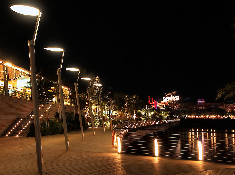
Sentosa boardwalk
12:44 AM
During the june holidays, my dad and I went to check out the Sentosa Boardwalk's night scene (his friend told him to check it out). It was really amazing and the view was just so magical, I felt like everything was a dream and it was actually quite romantic (weird because i was with my dad, hahaha)
Anyways, we had a photography session there and we took turns to play with the camera :)
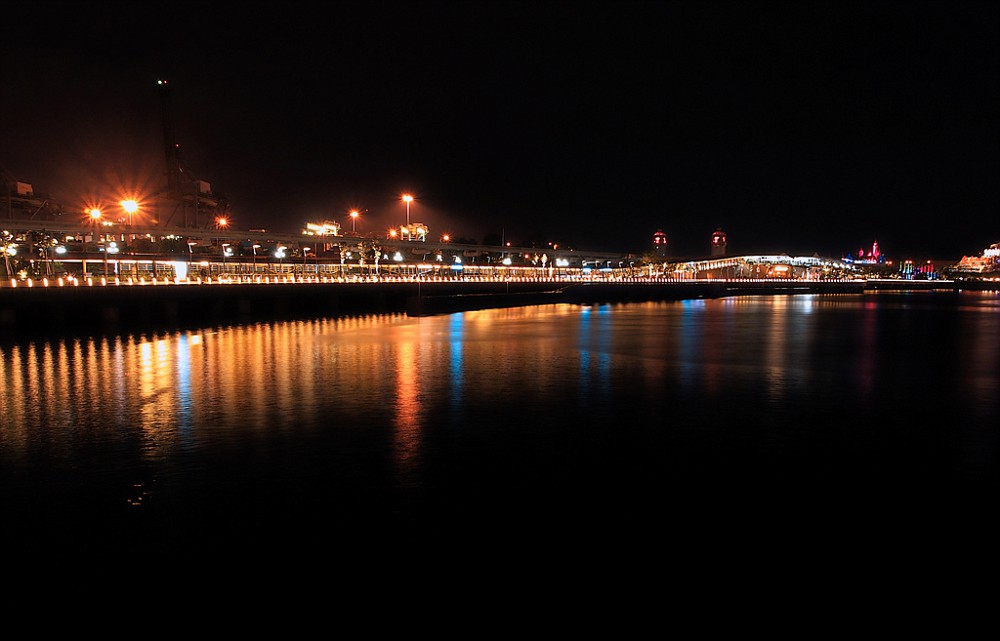
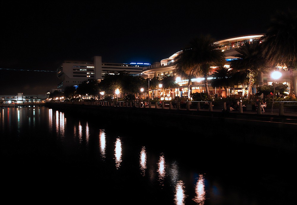
The bridge that links Vivo City to Sentosa, it seems very long but actually when you walk down the bridge, the scenery actually takes your focus off the distance and the walk is truly enjoyable. This is taken from the "banks" of Vivo City. I erally like how the lights are reflected off the water, they are so colourful, instead of being all white or all yellow, there are actually shades of blue and pink. There were boats on the right, in the water. But it was too dark to be taken, they didn't look very nice with flash either..
And so the journey begins. Look at the contrast between the colour of the lights, Vivo's lights are all white, while Sentosa's lights are so colourful. I guess this shows the difference between the commercialized world and a resort style world.
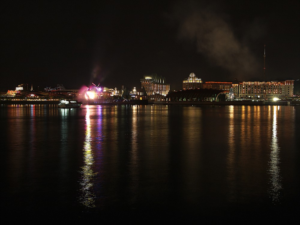
Half way across the bridge, the Song of the Sea performance is currently on, which explains the burst of light. I could hear the performance from where I was standing, who needs a ticket right? hahaha
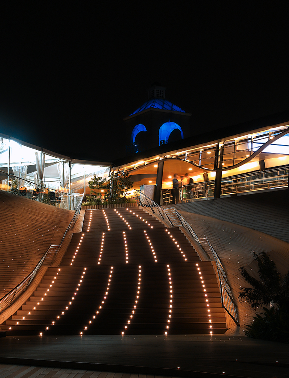
Approaching Sentosa!
To see the rest of the album, click here!
This was also taken with the Oly Pen EPL1, I really like this camera, it's so user friendly and captures amazing photos. :)Labels: art works, photography
Sunday, September 25, 2011
Labrador park
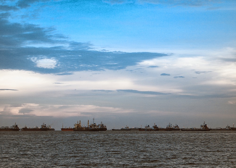
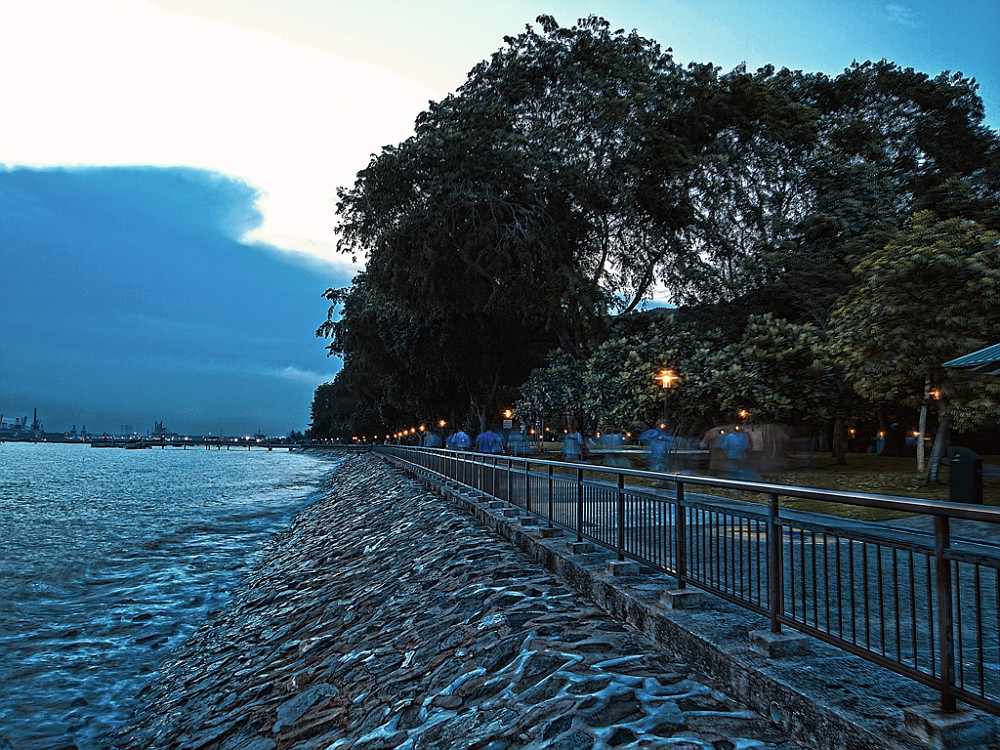
1:31 AM
At the start of this year, my dad wanted to go to labrador park to test out his new camera- Olympus E-PL1 (which i have now became the official owner. bwahahahaha)
So I tagged along for a run to build my stamina for SYF2011. After my run, i played with the camera and took a couple of photos:
This was taken from where i was sitting, waiting for my mom to come back from her walk :) Also, one of the few non-editted photos (my dad editted the rest). I really like how tall the satelite looks behind the trees, i was hoping i'd capture the essence of its height, but i felt it could be done better? oh well.
Before the sun set, everything still looked quite peaceful,
While the sun was setting, looks pretty sinister eh? I'm not sure if this is photoshopped, i cant tell... it looks photoshopped, but then again it doesnt :/
Another picture of the park, from the porch(?) at where we were sitting at, to our right was the outline of the park and so i decided to capture this as it shows 2 sides of the world to me, like the dangers of the sea and our safe home. I wanted to capture waves crashing on the rocks but the tide refused to cooperate. -_-"
If you can tell, this is Reflections, the condominium building near harbourfront! This is one of my favourite architecture designs because the gentle curves of the buildings are really hard to build, and to me, i feel like the building seem to intertwine subtly, and shoot for the skies.
Note: my photoshop skills are one kind of shitty, it is my dad who photoshopped the pictures.
To see more of his photographs and my childhood pictures, go to his fotki page
I guess you can say my dad's the one who made me fall in love with photography, he's the one who showed me how to use your camera to capture things from a different angle or draw attention to something people would usually take granted of.Labels: art works, photography
course work final
1:30 AM
The Best of Life's Recipes:
A recipe book that reflects life, and its components. By using different ingredients to represent different attitudes, I make use of food to show the ideal way to live your life, so that you become a better person. The recipes represent ways to improve your life by adopting certain traits and attitudes. In other words, if you adopt the habits mentioned in my works, it allows you to become a better person.
Here are the first 5 pages of my course work (4 including front page):
BASICALLY, IT IS TO BE PRINTED ON A4.
There is a line that cuts the A4 paper into the above size and it serves as my margin so that when i bind my book, i know that i cannot exceed this line. But luckily for ya'll, i am no longer lazy and cropped all the pages to what you should see in my book (excluding the binding portion).
The recipes are kind of self explanatory from the text so please click on the image to enlarge to read more about the recipe,
and i would just talk about the materials and how i did it.
I used illustrator to create the front page and all the text. Going for a more fun and casual feel to the works, i decided to use a hand writing font, as if it was hand written out. Also, i changed some words and ingredients to represent what they meant, like "hard" would be seen as "HARD".
For the front page, i made it cute and bubbly, hence the polaroids are outlined with a dash line, instead of a hard line, to make it more jumpy and playful. Also, the block letters are in a very child like manner, making it seem happy and joyful. I also added in polaroids as to me, polaroids are like capturing important moments, just like how all kinds of food are important, and that every ingredient added is also important. It makes up the recipe, just like how our characteristics make us up.
The drawings are all done in colour pencil or sometimes water colour and then scanned in. They are then used as back ground images or page numbers or pictures in the polaroid.
I decided that for every step of the recipe, i would use a food to represent the page number, which is a idea suggested from Mrs Tan, and i feel that it really makes my work stand out a little bit more :)
Also, the background images used to be smacked right in the centre which was very distracting indeed, so I shifted them around, cropped them off the page, etc. I hope that my final composition actually helps to lead the viewer's eyes to the text and the main point of the recipe. To me it did, but hopefully to ya'll it did the same!
The last page of the recipe would be an illustration of the works "coming to life" where by the ingredients come together to create the recipe, it is very representative and if you read the steps and the description of the recipe, it would be reflected in the works.
1st recipe: Chocolate Lava Cake
the drawing is to show that the cake stands out strong in the ruins of shattered chocolate. To show that it is rebuilt and stronger than before, that one's self esteem is higher than before. I placed it in the centre as the crushed chocolate also emphasizes the cake, they are of different sizes to show the different extents to how much one's self esteem can be crushed, be it very small, or still quite a large piece. And the chocolate that flows out shows the process of being molten before, that this is no easy journey. The ingredients that pour into the cake such as: Butter, Eggs, Milk, Flour, and Sugar, are actually representative of attitudes one should adopt in order to rebuild one's self esteem when it is crushed. To understand more, please click on the steps :)
I hope that the words would help to enhance the feelings of the work.
Labels: art works, coursework
course work #2
1:04 AM
These are the remaining pages of my coursework
The 2nd recipe: A burger to symbolize determination
The background fries as grass and a cloudy sky is to emphasize the height of the burger, which shows that it starts from the ground and reaches the sky. The fries was just playing with food because fries usually come with a meal in a fast food restaurant right? The flag at the top is like your goals, and the fact that it is planted deep into the bun shows that it is possible to conquer them (similar to how we planted a flag on the moon). The burger is swaying, from left to right to show how difficult life is, some times the surface area of which the next layer is able to pile on top is very big, sometimes it is very small. I used this to depict how we have to keep our balance and not topple over. Also, ingredients are falling out of the burger to represent relationships, whereby people will leave you and objects may break. I have ingredients like Healthy Ham, Relaxing Lettuce, Happy Cheese, CryAway Onions, etc. to show that in order to achieve our goals, we have to remember to be healthy, to take breaks, to see the joys in life and that everyone will cry as there is nothing wrong with crying. After all, after you cry, you do feel much better and happier.
I hope that people will understand that at this moment, life may seem in a mess and you're about to fall and break down but there is still hope, relax and stay positive, keep your balance and keep moving forward. The higher you go, the nearer you are to your goal.
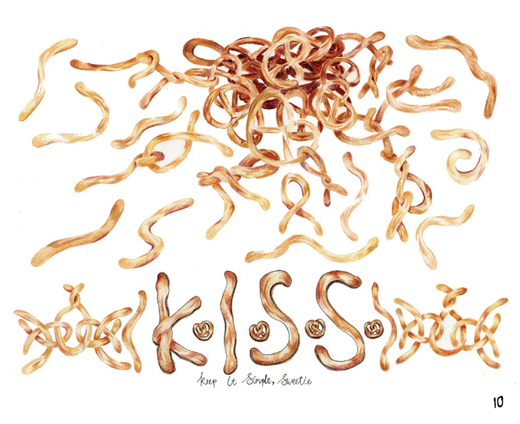
3rd recipe: Simpretzel | Simpretzle
There will be many incidents in which you find your life in a complete mess, and you're struggling to find the answers. Of course, when you're unsure about everything and you can't see the main problem, how are you going to be able to solve it? Hence, I suggest simplifying your problems and unravelling them. Just like how a pile of pretzels looks more complicated than a single pretzel, and a single pretzel looks more complicated than a long line of dough.
K.I.S.S. stands for: Keep It Simple, Sweetie (or stupid, depending on context. hahaha)
which is straightforward enough, keep your life simple, do not complicate matters. Keep your problems small and within control, rather than problems blown up so big, they are no longer controllableLabels: art works, coursework
|
Search
Labels
others
inspirations
writings
art works
course work
photography
Archives
 January 2011 January 2011
May 2011
August 2011
September 2011
Friends
Chermaine
Chiawei
Elizabeth
Heyao
Jiashin
Linhui
Liyi
Lois
Mingzhen
Rachel
Ruisian
Shihui
Shiyin
Shiyun
Valerie
Xinda
Xindi
Xuedi
Xueying
Zhiping
Zhiyi
Zhuhong
|
 C L A R E


